FRONT COVER PRODUCTION
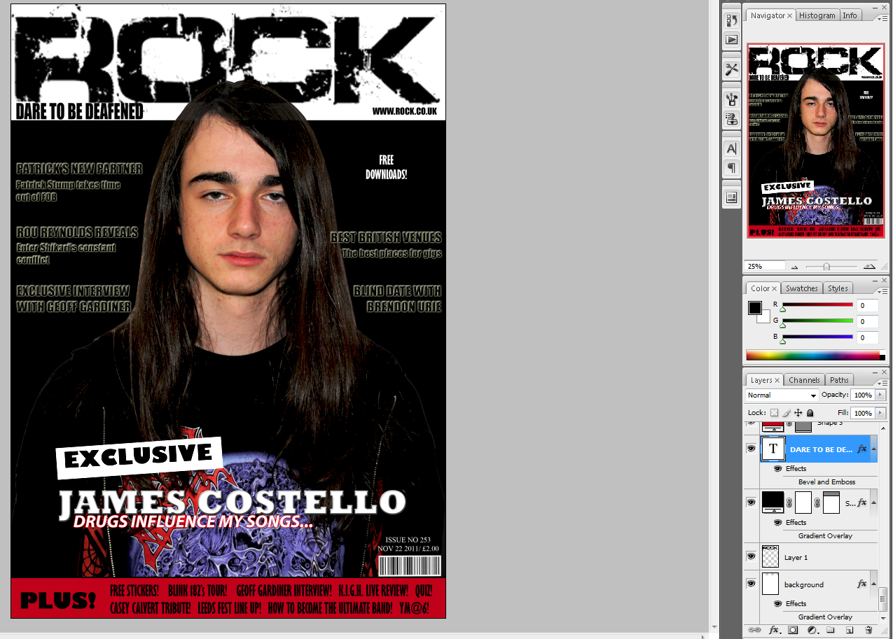
1st picture: I cut around the photograph I took of an artist. I placed it slightly over the title, so that the title can still be seen, as it's new to the target audience. The font appeals to the target audience and the image reflects the mode of address.

2nd picture: I have put on a gradient background and the main coverline for my magazine, anchoring the image. The black box at the bottom is for extra coverlines to entice the audience. Also, I lightened the photograph to make it stand out more and also blend in better with the magazine, so that it doesn't look seperate from the cover.

3rd picture: Here I have taken the main coverline off whilst focusing on the look of the rest of the cover. I changed the black box to red, so that it will stand out more and look more captivating to the audience. My positioning statement is 'DARE TO BE DEAFENED', situated undeneath the title on the left side. I added my coverlines in an appropriate font and the star at the top looks exciting to the target audience and highlights the special offer: 'Free Downloads!" 'Free' is a puff
word, used to draw in the consumer.

4th picture: I wanted to see what a black background would look like, but as you can see, the picture disappeared into the blackness and the coverlines didn't stand out enough. Although the main coverline looked eye-catching in the foreground.
5th picture: I put the gradient background back on, as it makes the main image stand out and the coverlines clearer.
The coverlines are now red so that they stand out more, also it ties in with the colour scheme reccommended by my target audience.
I made the positioning statement smaller, to mirror existing magazines.
The buzz word 'EXCLUSIVE' is now also red and I have rotated it on a larger angle, so that it looks more exciting.
The star with 'Free Downloads' written on didn't match the style of the rest of the magazine, therefore I replaced it with more coverlines.
Some of the stories in my 'PLUS!' section were the same as my coverlines, so I changed them to add more things to draw in the target audience, and give them more options to look at.
I resized the main image so it is bigger and is more capturing to the target audience. It prevents the page becoming full of text and it looks more visual.
CONTENTS PAGE
Picture 1: I have the title 'CONTENTS' at the top, so that is it clear what page it is. The website, issue number and cover date is shown underneath. I have also put the magazine title logo on it to reinforce the brand.
I have started to put page numbers and coverlines on it. I've decided to put the stories into sections, as it reflects the Kerrang! contents page I have studied. This will make it look realistic and appeal to the target audience. As I start to fill the page, it will develop into a professional contents page.
Picture 2: I moved the text and title to the lift side of the page, as this is how other exisitng magazines have layed out theirs.
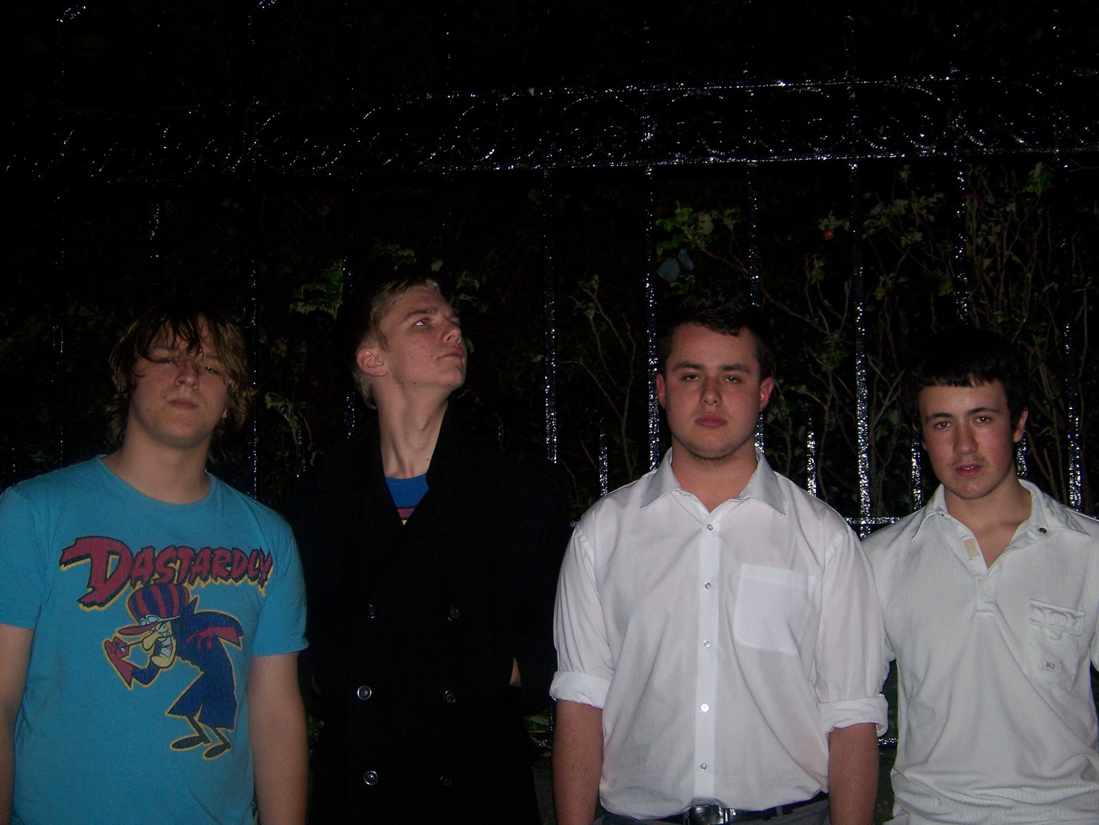
The main image is of Geoff Gardiner, the subject of my double page spread.
I also have another image of a band and a photo of the artist on the cover.
Picture 3: I kept the coverlins on the left, but played around with where I wanted to position the title. Here it is on the right, above the images. The numbers on the images anchor them to the page and what story it is. There are still some spaces which need to be filled and I need to include subscription details.
I've now put on my subscription details in a box at the bottom on the left. This stands out, so that the target audience will be more likely to look at it and want to subscribe, meaning the magazine will have permanent customers and make more money. I added credits for the cover photo and contents page, however I feel it looks a little out of place.
By splitting the coverlines into 3 columns, it looks more professional. I decided that the contents title looked better on the left side. I moved the images to see how they would look in different places.
I made the title fit across the whole page, as this appeals to the codes and conventions of contents pages. I changed the main image and image of the artist, as they looked too similar to the ones on my other pages. This is still in progress and I will be adding more text.
All of the coverlines are on now. The pictures fit together neatly. The numbers are in red to stand out and my contents page now looks real!
DOUBLE PAGE SPREAD
Before starting my double page spread on 'Quark', I had to change the number of columns to 3. This is so my article will fit better and look professional.
Here is my article in short paragraphs on the right page, with the stand first positioned above. My stand first is
"Scar. Techno. Angry." -Three words Geoff Gardiner used to describe the amazing sound of White Trash ana Half Cast. They may not have played Leeds yet, but these four men are definitely on their way to being total rock legends!
The image on the left page is a photograph I took of a guitarist.
Here you can see I have included a drop capital at the beginning of the article, a drop quote on the image and I've put on a title. Also, I have cropped the image to make the guitarist stand out and draw in the reader.
Here you can see that I've made my title, drop capital and band name red. By adding colour, it makes the article look more interesting and the text appears broken up. Also, the end of my article (Free single) is in red. The title stands out in red. I've moved the drop quote to get a better look at my double page spread before adding it back in afterwards.
I made Geoff Gardiner's name larger to make it really eye-catching. The red definitely makes it more capturing to the target audience. I've put page numbers with the website next to it, this matches the codes and conventions of dps. I've put a drop quote within the text, which draws in the reader and the larger text also looks more visually appealing. I moved the drop quote on the image to where there is a white gap, making it fill the space better.

My ttitle was boring, therefore I changed it to an intriguing quote. The title bleeds onto the image, bringing the pages together. I have zoomed in on the image, so that the artist is the main focus of the page. His use of direct address draws in the target audience. My stand first was too long, it is now: "Geoff Gardiner. Rock legend." -This is short and sweet. I took a few lines out of my article to make it shorter and more appealing to the target audience. My drop quote is now in white text on the image, making it stand out more. Credits are beneath the stand first.
My internal drop quote now fits within the guidelines to match the text in my article. At the end of the article, I indented the red text, rather than it being seperated from the article. My article now looks very neat and it all blends together.