Thursday, 19 January 2012

Production in Progress

 FRONT COVER PRODUCTION


1st picture: I cut around the photograph I took of an artist. I placed it slightly over the title, so that the title can still be seen, as it's new to the target audience. The font appeals to the target audience and the image reflects the mode of address.


2nd picture: I have put on a gradient background and the main coverline for my magazine, anchoring the image. The black box at the bottom is for extra coverlines to entice the audience. Also, I lightened the photograph to make it stand out more and also blend in better with the magazine, so that it doesn't look seperate from the cover.


3rd picture: Here I have taken the main coverline off whilst focusing on the look of the rest of the cover. I changed the black box to red, so that it will stand out more and look more captivating to the audience. My positioning statement is 'DARE TO BE DEAFENED', situated undeneath the title on the left side. I added my coverlines in an appropriate font and the star at the top looks exciting to the target audience and highlights the special offer: 'Free Downloads!" 'Free' is a puff
word, used to draw in the consumer.
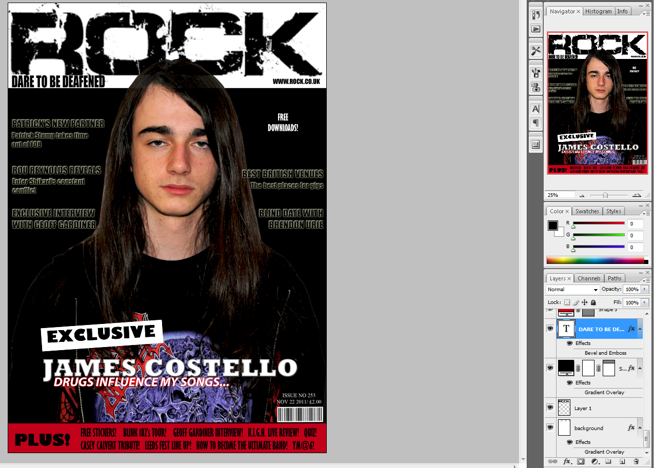


4th picture: I wanted to see what a black background would look like, but as you can see, the picture disappeared into the blackness and the coverlines didn't stand out enough. Although the main coverline looked eye-catching in the foreground.


5th picture: I put the gradient background back on, as it makes the main image stand out and the coverlines clearer.
The coverlines are now red so that they stand out more, also it ties in with the colour scheme reccommended by my target audience.
I made the positioning statement smaller, to mirror existing magazines.
The buzz word 'EXCLUSIVE' is now also red and I have rotated it on a larger angle, so that it looks more exciting.
The star with 'Free Downloads' written on didn't match the style of the rest of the magazine, therefore I replaced it with more coverlines.
Some of the stories in my 'PLUS!' section were the same as my coverlines, so I changed them to add more things to draw in the target audience, and give them more options to look at.
I resized the main image so it is bigger and is more capturing to the target audience. It prevents the page becoming full of text and it looks more visual.


CONTENTS PAGE


Picture 1: I have the title 'CONTENTS' at the top, so that is it clear what page it is. The website, issue number and cover date is shown underneath. I have also put the magazine title logo on it to reinforce the brand.

I have started to put page numbers and coverlines on it. I've decided to put the stories into sections, as it reflects the Kerrang! contents page I have studied. This will make it look realistic and appeal to the target audience. As I start to fill the page, it will develop into a professional contents page.


Picture 2: I moved the text and title to the lift side of the page, as this is how other exisitng magazines have layed out theirs.
The main image is of Geoff Gardiner, the subject of my double page spread.
I also have another image of a band and a photo of the artist on the cover. 


Picture 3: I kept the coverlins on the left, but played around with where I wanted to position the title. Here it is on the right, above the images. The numbers on the images anchor them to the page and what story it is. There are still some spaces which need to be filled and I need to include subscription details.

I've now put on my subscription details in a box at the bottom on the left. This stands out, so that the target audience will be more likely to look at it and want to subscribe, meaning the magazine will have permanent customers and make more money. I added credits for the cover photo and contents page, however I feel it looks a little out of place.

By splitting the coverlines into 3 columns, it looks more professional. I decided that the contents title looked better on the left side. I moved the images to see how they would look in different places.

I made the title fit across the whole page, as this appeals to the codes and conventions of contents pages. I changed the main image and image of the artist, as they looked too similar to the ones on my other pages. This is still in progress and I will be adding more text.


All of the coverlines are on now. The pictures fit together neatly. The numbers are in red to stand out and my contents page now looks real!
DOUBLE PAGE SPREAD


Before starting my double page spread on 'Quark', I had to change the number of columns to 3. This is so my article will fit better and look professional.


Here is my article in short paragraphs on the right page, with the stand first positioned above. My stand first is "Scar. Techno. Angry." -Three words Geoff Gardiner used to describe the amazing sound of White Trash ana Half Cast. They may not have played Leeds yet, but these four men are definitely on their way to being total rock legends!
The image on the left page is a photograph I took of a guitarist.


Here you can see I have included a drop capital at the beginning of the article, a drop quote on the image and I've put on a title. Also, I have cropped the image to make the guitarist stand out and draw in the reader.


Here you can see that I've made my title, drop capital and band name red. By adding colour, it makes the article look more interesting and the text appears broken up. Also, the end of my article (Free single) is in red. The title stands out in red. I've moved the drop quote to get a better look at my double page spread before adding it back in afterwards.


I made Geoff Gardiner's name larger to make it really eye-catching. The red definitely makes it more capturing to the target audience. I've put page numbers with the website next to it, this matches the codes and conventions of dps. I've put a drop quote within the text, which draws in the reader and the larger text also looks more visually appealing. I moved the drop quote on the image to where there is a white gap, making it fill the space better.


My ttitle was boring, therefore I changed it to an intriguing quote. The title bleeds onto the image, bringing the pages together. I have zoomed in on the image, so that the artist is the main focus of the page. His use of direct address draws in the target audience. My stand first was too long, it is now: "Geoff Gardiner. Rock legend." -This is short and sweet. I took a few lines out of my article to make it shorter and more appealing to the target audience. My drop quote is now in white text on the image, making it stand out more. Credits are beneath the stand first.


My internal drop quote now fits within the guidelines to match the text in my article. At the end of the article, I indented the red text, rather than it being seperated from the article. My article now looks very neat and it all blends together.

Wednesday, 18 January 2012

Tuesday, 17 January 2012

Production materials

Cover photograph-
This is an image I have taken of an artist.
It appeals to the target audience and relates to the magazine genre.
The mode of address is informal and matches the tone of my magazine.


Contents Page-
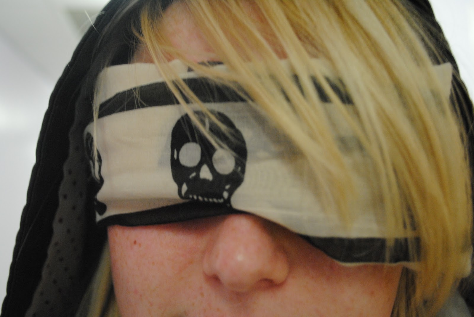
This will be the biggest image on my contents page, as it is for the main story on my double page spread. The number on the image which anchor what story it is.


The blind fold matches the coverline "Blind date with Brendon Urie".
The skulls on the blindfold make it appealing to the rock genre.
The model in the picture has a long fringe, which will mirror many of my target audience.
It will be smaller than my main image.


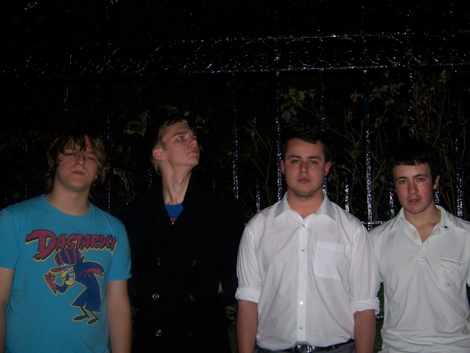
This is a band I interviewed, however I felt that the interview with the guitarist, Geoff Gardiner, was better.
I will use this picture on the contents page, but I will crop it to fit in with the rest of the page. It will be small, as it's not a main feature.


Here is another photograph I have taken of artist James Costello. It is different from the front cover and reinforces the exclusive interview to the reader.


Double Page Spread Photo-


ARTICLE

After interviewing the artist I will base my DPS on, I listened to the audio clip I recorded, then wrote everything onto a word document. This will help me to conduct my article and then put it on Quark. (Please click to enlarge image)

Wednesday, 16 November 2011

Tuesday, 15 November 2011

Article Research

Interview Questions
This is what I will ask the guitarist.

1.       When did you start learning to play the guitar?

2.       Can you play any other instruments?

3.       Who are your main musical influences?

4.       What is your favourite famous guitar solo?

5.       What is the first record you ever bought?

6.       Do you still own any vinyls?

7.       How do you think the internet affects the music industry?

8.       Describe your music in 3 words.

9.       Is there any rivalry with other bands?

10.   Who have you most enjoyed working with?

11.   How did it feel to headline for the first time?

12.   How do you feel when you perform?

13.   How did you find your tour?

14.   What warm-up methods do you use before a gig?

15.   Is there any conflict between band members?

16.   What would you do if you weren’t in the band?

17.   Has it always been your dream to pursue a career in music?

18.   Who would you love to record with?

19.   How would you react if you were asked to perform at the Leeds festival?


DPS article:
Geof Gardiner. Rock legend.
Geoff’s laid back demeanour came across as we started to talk with his appearance and passion for black alluding to his musical style.
“My favourite place to be is on stage,” enthused Geoff Gardiner, lead guitarist of White Trash ana Half Cast. “As soon as I start playing, I sorta get lost in it.” From the moment Geoff started talking about his music, he changed from a shy guy to the confident, energised performer we see on stage.
Inspired by his dad, his passion began when he was 14, having started learning the guitar, his love for music grew.
Some of Geoff’s influences include Radiohead, Rancid and Nirvana, with Jimmy Hendirx’s ‘All Along The Watchtower’ being his favourite guitar solo, as you can’t help being drawn in by the hypnotic sound. The first albums he bought were ‘Nevermind’ -Nirvana, and ‘Dookie’ –Greenday. “I still buy vinyls quite regularly” -It’s always a good sign of a hard core music enthusiast to hear that!
Having gone through college with singer, Collin Jones they worked on numerous projects outside Geoff’s band and Geoff told ROCK that he’d love to work with him again. “We’ve learnt a lot together music-wise”. Clearly Geoff has taken inspiration from many sources.
White Trash ana Half Caste were fortunate enough to capture the attention of Alan McGee, the manager of Oasis. Having recognised their talents, he took them on and they were soon on tour, supporting White Mice. “It was good, yeah! It’s a way to get out there. I did enjoy it, it was a good experience.”
Not long after, the band was asked to perform at the Leeds Festival. Unfortunately there was personal issues and they had to pull out, but “at the time we were very excited! It was a letdown not to, but actually getting to play it would be absolutely brilliant!”
Geoff describes headlining for the first time as “the best feeling in my life. I’ve never come across anything better than that.”  He still gets nervous before a live gig and does warming up exercises to get his fingers going. By the time he’s on stage, Geoff is full of energy and ready to rock!
There was a slight hesitation from Geoff when we asked if there was any conflict between band members. “There has been, nothing too major. There’s been a few discrepancies with which direction the songs should go, or which songs shouldn’t be played live. But nothing too extreme.” Luckily for fans, there’s no sign of them breaking up.
Can Geoff play anything else? “Not competently, no” Geoff says modestly. “I can do a little bit on the drums, little bit on the keyboard, but mainly guitar”.  You get the feeling that Geoff likes to try out all the band’s instruments and he’s most probably better than he’s letting on.
As it’s always been Geoff’s dream to pursue a career in music, he admitted: “If I wasn’t in a band, I’d be wishing I was!” We were also told that he’d love to record a song with Tom Waits. So would we!

 Geoff sees the emergence of the internet as a great place for young bands to be heard. Their  popular myspace page got them a lot of acknowledgement and they gained many fans via this platform.
There was a slight hesitation from Geoff when we asked if there was any conflict between band members. “There has been, nothing too major.  There’s been a few discrepancies with which direction the songs should go, or which songs shouldn’t be played live. But nothing too extreme.” His hesitation causes some suspicions but, luckily for fans, there’s no sign of them breaking up.
It was an absolute pleasure to talk to Geoff Gardiner and we at ROCK, are hoping that White Trash ana Half Cast will be at Leeds soon, as we just can’t get enough of this awesome band!
‘Voices In My Head’ is now free to download on iTunes until 1st January 2012!

Tuesday, 8 November 2011

Planning Production

These are the detailed decisions I've made about what I'm going to produce.
Front cover image: James Costello, Rock artist.
Coverlines:
MAIN STORY- Exclusive! James Costello.. "Drugs influence my music"
Roy Reynolds reveals... We get the inside scoop about Enter Shikari's constant conflict!
Blind date with Brendon Urie... We picked one lucky subscriber to unexpectedly meet the singer of Panic! At The Disco
Patrick's new partner... Fall Out Boy's Patrick Stump takes time out of the band to work on a project with upcoming artist Dennis Jones.
Competition! -Win tickets to a gig of your choice!
FREE downloads!

Text for contents page:
Regulars:
Fan letters
Album reviews
Gig reviews
Upcoming gig list/ tour dates
New bands and artists
Poster page
Music-related crosswords
Features:
Best English venues
Blink 182's new tour
Leeds festival line up
Free stickers
Exclusive poster of Tom Delonge
Competition- Win tickets to a gig of your choice!
Band news- MCR have split up!
Vote for band of the year
Tribute to casey Calvert
Competition winner interviews Blink 182
How to become the ultimate band
Quiz- How well do you know your music?
Free downloads
The Stone Roses reunion
Guns 'n' Roses UK tour
Exclusive interview with ____ (new artist that will be my main cover story)
Roy Reynolds reveals... We get the inside scoop about Enter Shikari's constant conflict!
Blind date with Brendon Urie... We picked one lucky subscriber to unexpectedly meet the singer of Panic! At The Disco
Patrick's new partner... Fall Out Boy's Patrick Stump takes time out of the band to work on a project with upcoming artist Dennis Jones.


Images for contents page:
(Blind date with Brendon Urie article) Close-up of someone wearing a blindfold
James Costello- image on front cover.
DPS image.
Small image of band

Double Page Spread:le photographs that I took which I could us


Publication Plan

This is the information about my music magazine.

Title: ROCK
Positioning statement: Dare To Be Deafened
Frequency of publication: Weekly
Price: £2 (Although my questionnaire showed that £3-4 was a reasonable price, it is too expensive for a weekly music magazine. My target audience won't be able to afford to buy it every week.)
Distribution: Supermarkets, newsagents, music shops e.g. HMV
Rationale: The appraoch of the magazine is to relate to fans and get involved and personal with bands, so that readers feel like they've met them. It will appeal to young people who are more open to different aspects of rock music.
Style: Informal, slang, laid back, exciting, short paragraphs, relevant images, consistent colours.
Regulars:
Fan letters
Album reviews
Gig reviews
Upcoming gig list/ tour dates
New bands and artists
Poster page
Music-related crosswords
Features:
Best English venues
Blink 182's new tour
Leeds festival line up
Free stickers
Exclusive poster of Tom Delonge
Competition- Win tickets to a gig of your choice!
Band news- MCR have split up!
Vote for band of the year
Tribute to Casey Calvert
Competition winner interviews Blink 182
How to become the ultimate band
Quiz- How well do you know your music?
Free downloads
The Stone Roses reunion
Guns 'n' Roses UK tour
Exclusive interview with ____  (new artist that will be my main cover story)
Roy Reynolds reveals... We get the inside scoop about Enter Shikari's constant conflict!
Blind date with Brendon Urie... We picked one lucky subscriber to unexpectedly meet the singer of Panic! At The Disco
Patrick's new partner... Fall Out Boy's Patrick Stump takes time out of the band to work on a project with upcoming artist Dennis Jones.
House Style
Title: Defused (www.dafont.com)
Coverlines: Impact 14pt
Headlines: Arial Black 54pt
Standfirst: Arial 14pt
Credits: Arial 10pt
Body text: Arial 11pt
Colour scheme: Black, red, white